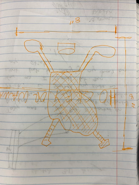
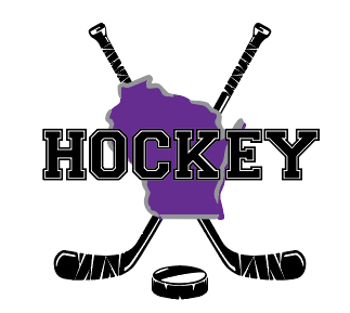
My Design
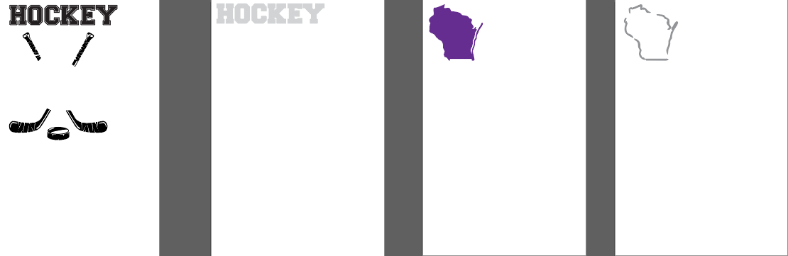
When I was introduced to this project, I already had an idea of what I wanted to do. I knew it had to be something about hockey. We needed 4 colors and text in our screen print. So, I started looking at hockey picture and decided to make a combination of several pictures.
|
|
|
Knowing that I needed at least 4 colors and text, I kept my design simple but sharp. Making the shape of WI purple and the outline silver made the print pop. I downloaded a text off the internet called VARSITY TEXT and used that for my HOCKEY. The other two colors I used were black and white. The white was used so behind the black text of and showed through the spaces in the text so it looked like HOCKEY was in front of everything. I cut out the center of the sticks to eliminate less waste and so it made lining up the WI logo in the right spot.
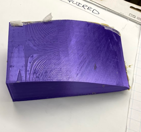
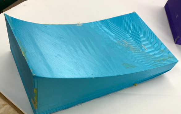
HEAT PRESS
Laying out the vinyl straight was a little challenging but with time and patience turned out great
|
|
|
|
|
|
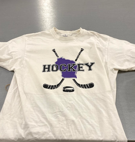
FINAL PRODUCT
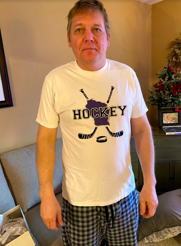
I am very happy how my T-shirt turned out! I gave it to my dad for a present. He loves hockey and had a big smile on his face when I gave to him at Christmas. I learned some new Technics and how to use the heat press. Before doing this project when it was first introduced it sounded difficult and somewhat challenging. But after taking my time, I quickly learned that it was quite easy and fun process. I also learned new Technics in Adobe Illustrator. Mrs. Procter introduced me to downloading new text witch was helpful. Also I learned how to change my color when I paste picture into illustrator. Instead of the image coming up black I can make it the original color scheme and more. Overall, was a good project and I can't wait to wear my shirt in the summer.
